The world of ecommerce moves extremely fast and it is nearly impossible to adapt to every latest and greatest trend.
But it’s critical to keep up with the changes that directly impact revenue. Site design fits into that category. Keeping a close eye on design trends becomes even more important as online competition continues to grow.
The latest ecommerce website design trends are a reflection of customer preferences. As people use technology in new ways – e.g. social media and mobile browsing – it resets their expectations. And they are looking for online shopping to mirror other digital experiences.
With that in mind, let’s explore five ecommerce design trends. If your web store is in need of a refresh, or you’re preparing to launch a new site, being aware of these trends will help you create a site that drives revenue and provides a great brand experience.
Photography takes center stage
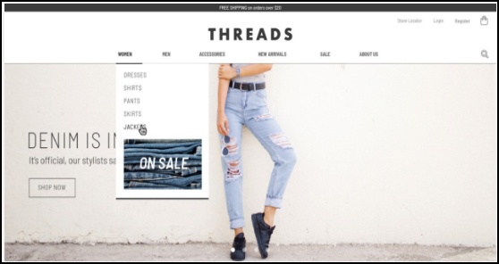
Photos should be the centerpiece of your site, starting with the home page. High-quality photography has taken priority over product lists – everything is designed around pictures. It catches and keeps your audience’s attention as people have become accustomed to scrolling through pictures on Instagram and Facebook.
The concept of “knolling” is an especially popular photography technique for retailers. Knolling is when objects are laid out in a symmetrical way and captured from above without using a model. For example, an apparel retailer may arrange a shirt, pants, a belt, watch, and shoes that pair together nicely. Displays like this are especially popular on Instagram and Pinterest.

Video, video and more video
It’s not exactly news that video is a highly effective communication method. Video is the most engaging type of content you can produce, and it’s instantly shareable on Instagram, YouTube, Twitter and a variety of other platforms.
As video has grown in popularity, more merchants are building websites around it. This could include a full wrap on home pages that establishes your brand’s look and feel, maybe showing people using your product. Videos are also becoming more common on product pages – for example, a short clip of someone wearing a shirt so the shopper can envision how it would look on them. It’s yet another way to drive conversions.
There’s no doubt that more videos will appear on ecommerce sites in the future. The medium brings products to life in a way that photos simply cannot.
Minimalist menus
Less is more when it comes to modern ecommerce website design. A large, expansive menu that runs across the page with 10 rows per column is a relic of the past. A less cluttered menu with fewer options shows customers a higher level of quality and authenticity. Oversized menus are an even bigger issue with mobile shopping, which becomes more popular every year. A menu that eats up an entire smartphone screen leads to a frustrating customer experience that hurts traffic and conversions.
If you sell a large variety of products, find a way to organize that into a reasonable number of categories. The visitor can always take a deeper dive into specific sections if they want to see more offerings. First and foremost, your site needs to provide an enjoyable experience for the customer that will encourage engagement and increase time spent on the site.

It’s about the brand story – not just the product
More brands are putting themselves front and center. Brands want to tell their story to reveal the unique personality that distinguishes them from competitors. This impacts site design because the company’s story may be just as prominent as product offerings. Maybe it’s a video about the brand mission, or support of a social cause, or a brief write-up on what inspired the business.
Consumers are increasingly interested in this “brand story.” It tightens that relationship between shopper and business, which can positively affect sales. This is especially popular among smaller retailers who want to share something about themselves with shoppers
Promoting in-store pick-up
This is not something that applies to everyone, since a number of online retailers do not have brick-and-mortar stores. However, people expect to get products faster than ever before, and buy online, pick-up in-store works toward that goal. It explains why more customers are taking advantage of this option than ever before. In-store pick-up can also be a cost-effective option for the retailer since it eliminates shipping costs.
Retailers are pushing this option by showing inventory at nearby stores on product detail pages. It has become a greater focus for companies that have physical locations because it has serious benefits for both the customer and the business. That’s why it should be something you think about when designing your web store.
If you keep these ecommerce website design suggestions in mind when building or refreshing your online store, you’re set up for success. These trends are dynamic, and it’s critical to keep your site design up-to-date with shifting customer preferences and expectations. That will help power the long-term growth that every merchant seeks.
Article credit: Ian McCue, Content Manager


