Several weeks ago, we shared an article that described some of the new features of the upcoming User Interface from NetSuite, tentatively scheduled to be released in the third quarter of this year. You may click over to our previous article for a detailed description of the upcoming UI. Today, we are sharing some screen shots that NetSuite recently released so you can have a more in depth look at the new UI. And, at the end of this article we are including a couple of resources to prepare you for the new UI release.
A Bold New Look
The first thing you will notice about NetSuite’s new UI is the bright refreshing colors and icons with larger easier to read fonts and a clean layout to find what you need easily.
![]()
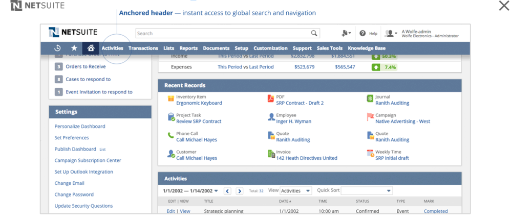
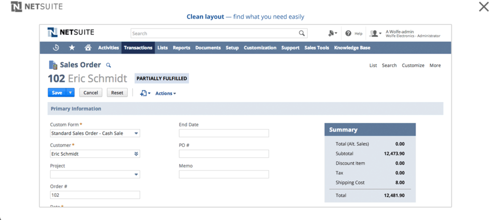 The new anchored header gives you instant access to global search and navigation.
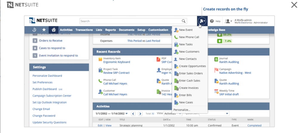
 You will also enjoy the ability to create records on the fly as well as the new smart scrolling feature.
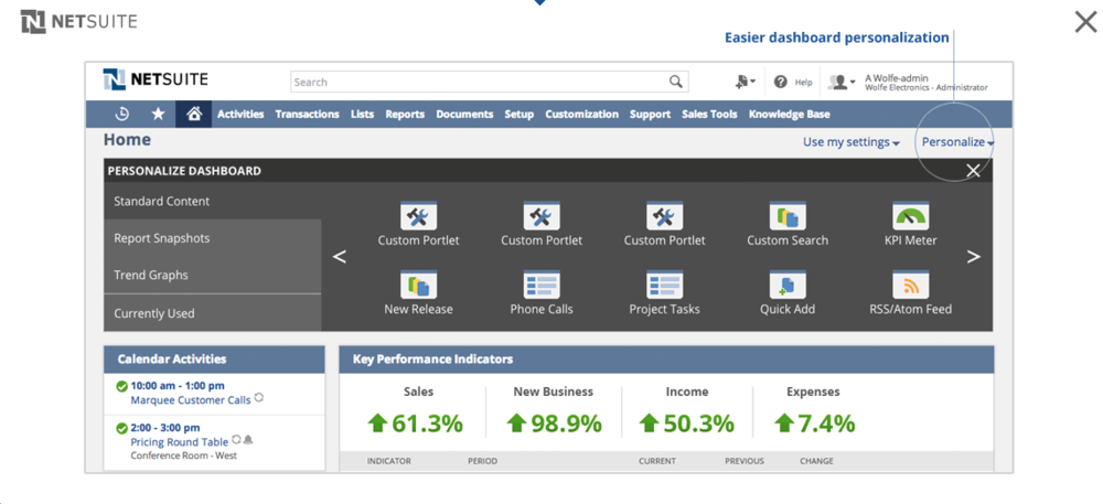
The dashboard can be easily personalized with intuitive, user friendly buttons.
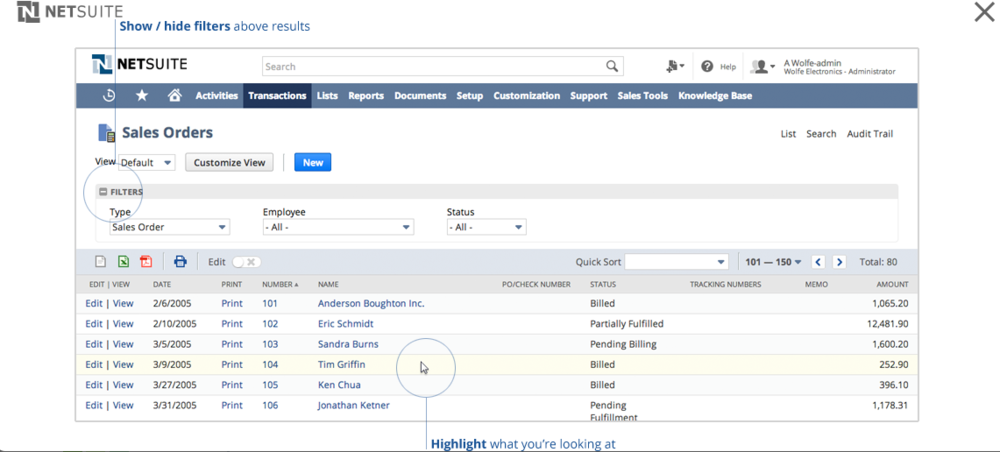
 Improved usability of list page views include show/hide filters above results as well as the ability to highlight what you are viewing.
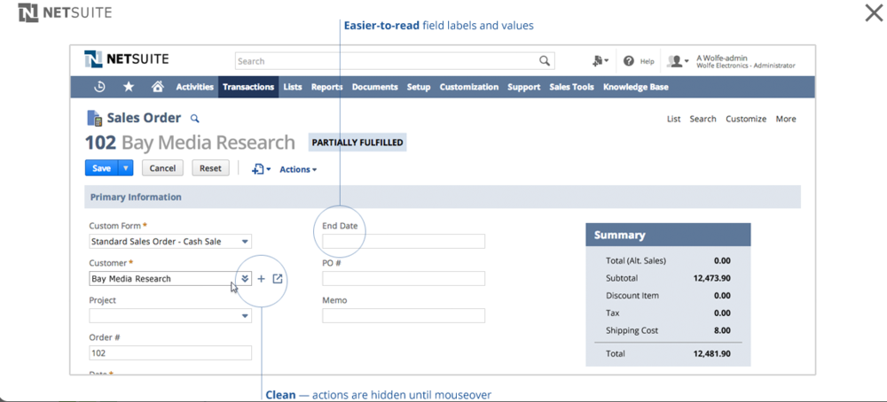
Form pages have easier to read labels and values as well as a cleaner design with actions hidden until mouseovers.
And if you are an administrator or technical team member who is responsible for preparing your organization for the UI upgrade, NetSuite has you covered with an informative video. You may also want to download NetSuite's handy checklist for preparing for the new UI.
What are you looking forward to the most with the NetSuite's new user interface? We love to hear from our readers, so please leave your thoughts in a comment below!

The Vested Group
1001 18th Street
Plano, TX 75074
USA
(972) 429-9025
Send Us an Email
Copyright © 2024. All rights reserved. Terms of Service and Privacy Policy. Cigna MRFs.